
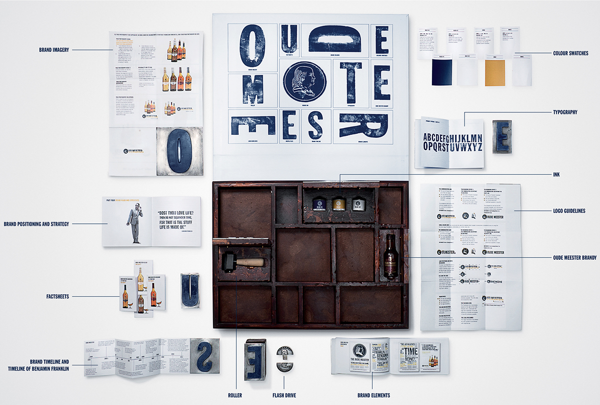
A Style Guide is a reference tool outlining everything that makes up a brand – typography, imagery, promotional best practice and more – setting the guidelines for a consistent message, tone and look.
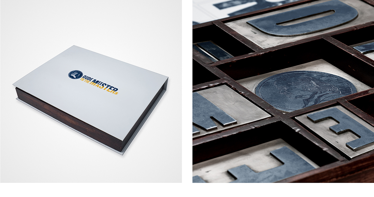
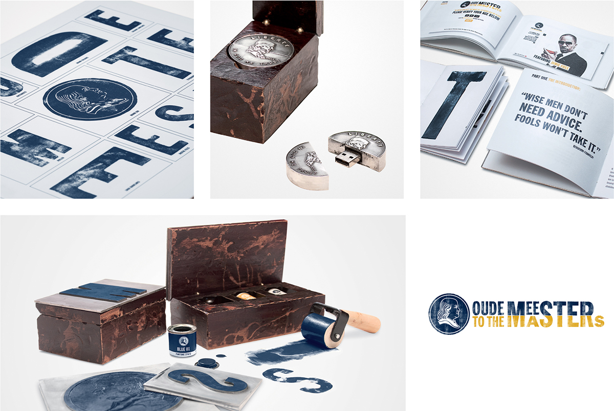
As part of the re-launch of Oude Meester, our Style Guide also needed to inspire people, so we turned to the icon on our bottle – a certain Benjamin Franklin. Although Franklin was a master of many things, his first love was printing. He even has a typeface named after him, Franklin Gothic, which we used in the campaign.
In homage to this, we created an old-fashioned printer’s tray, with lead letters which people could use to print the brand name and logo. Underneath each letter was a box with a booklet outlining the brand guidelines. In some
boxes were other relevant paraphernalia, including ink, rollers, a bottle of Oude Meester and finally a flash drive, based on the American 50c coin which features Franklin’s bust, with all the brand’s work saved on it.


